Case Study: Experience healthchecks (2022)
Overview
Challenges & opportunities
There were three key areas of opportunity.
Customer feedback wasn’t making it into product backlogs effectively and all of our success metrics as a digital team were based primarily on business outcomes
We lacked clear metrics as an experience design team to measure success
Internal survey data showed that the team felt like there was a disconnect between the work they were delivering and the metrics being shared - they struggled to understand the direct impact on their work
Solution & outcomes
There were two primary solutions:
A new balanced scorecard for teams that took into account both business outcomes and customer experience.
A new process we called “Health Checks” - essentially a design sprint to tackle qualitative and quantitative issues.
I developed a framework to measure, share and workshop user experience metrics for key journeys across the entire digital team. I shared out the work to senior executives and hundreds of designers, product owners, developers, QAs and functional managers across the digital team.
By implementing the Health Check we were able to increase employee engagement (as measured by our internal survey) by over 50 points, drive 40+ product ‘epics’ across 5+ key journeys, and bring together partners from across the bank.
A/B testing some of the ‘experience epics’ demonstrated a ~25% increase in conversions. More importantly, it changed how we work as an organization.
We’re implementing 7+ new CSAT surveys across key journeys and our Product partners are now accountable for user experience (rather than just business outcomes, like sales).
My role
Senior Design Manager
How to bring user feedback into your Agile delivery process with ‘Experience Health Checks’
If you work in agile development, you know that that customer feedback is a core part of the agile delivery process. After every release you should be monitoring performance, gathering user feedback, and creating new product backlog items to optimize the experience.
It’s a simple process in theory, but if you work at a large enterprise then you already know that gathering and implementing customer feedback is easier said than done. At an enterprise, there are stakeholders to keep happy, budgets to meet, features to deliver, urgent updates to push and timelines that can’t be missed. Customer feedback can sometimes fall to the wayside.
That’s the challenge we faced at the Bank of Montreal.
Our digital teams have become industry-leading delivery machines. We shipped product after product, feature after feature. In fact, we’ve were so laser-focused on delivering award-winning experiences that we didn’t always have the time to pause, gather feedback and iterate.
That’s a problem.
Users have higher expectations for digital experiences than ever. As we continue to move towards a world of open banking, challenger banks and generative AI those user expectations are only getting higher… and it’s also becoming easier than ever for customers to switch banks when those expectations are not being met.
It’s no longer good enough to ship features. You need to build meaningful experiences. If you don’t, your competitors will.
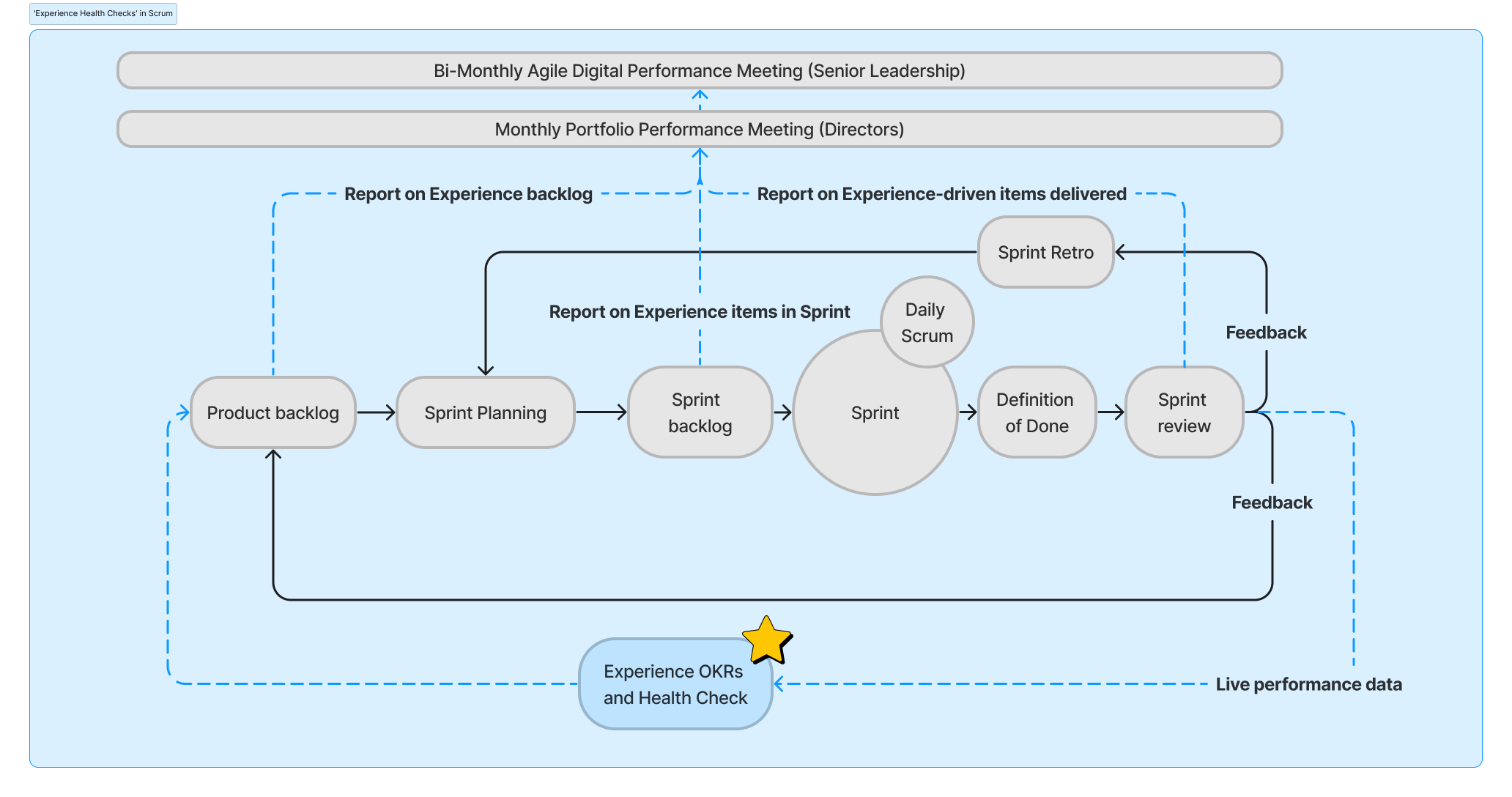
That’s one of the core of our move towards implementing a new ceremony we called “Experience Health Checks”.
There are three aspects of the Health Check.
The Experience Dashboard which lays out the key metrics and customer pain points.
The Experience Health Check workshop which brings together stakeholders to ideate on real user problems.
Reporting progress back to senior leaders.
By implementing the Health Check we were able to increase employee engagement (as measured by our internal survey) by ~50 points, drive 40+ epics across 5+ key journeys, and bring together partners from across the bank. A/B testing some of those epics has shown a ~25% increase in conversions. More important than immediate results, we’re driving 7+ new customer survey implementations across key journeys and our Product partners are now accountable for user experience (rather than just business outcomes, like sales).
The best part? Health Checks didn’t require any new technical implementation and fit seamlessly into the agile delivery process.
Here is how we did it:
1. Define the problems
In our case we had three problems that we wanted to solve.
First, we wanted to ensure that customer feedback was making it into the product backlogs and into sprints.
Second, we lacked a metric (or metrics) for quantifying the effectiveness of the Experience Design team to senior leadership.
Third, our internal team survey revealed that Product Designers felt they both lacked insight into performance and influence on product roadmaps.
If you already have a mechanism for bringing user insight into your product backlog, if your Product Designers are highly engaged and aligned with product partners, and if you already have a method of measuring experience design success at the leadership level, then you probably don’t need to introduce Experience Health Checks.
2. Discovery - understand the existing landscape
It’s important to avoid new implementations which can require time, money and consensus (three hot commodities in an enterprise). In our case we had a Adobe Analytics, Power BI, intercept surveys, NPS, and other data sources at our disposal. Each team had different tools, methodologies and levels of maturity.
Fortunately, I have a strong background in Adobe Analytics so I was able to build custom dashboards for our team. Combined with other data sources (and even simple usability testing) we were able to build a full picture for each team.
If you don’t have the data, then you’re going to either have to improvise or put together an implementation plan. If you work at an enterprise, then half the battle will be bringing the right people in the room to actually find the data!
3. Choose a methodology
There is no shortage of methodologies for measuring user experience, and there’s no right or wrong answer.
Here is a breakdown of some of the options we explored:
CSAT (Customer Satisfaction) measures how satisfied customers are with a company’s products or service. However it relies on subjective input alone (rather than incorporating analytics) and requires a heavy implementation if you don’t already have it.
SUS (System Usability Scoring) is a quick and dirty way of measuring customer experience across ten items. It’s essentially a survey that you can give to users, but there are limitations. The survey is long and better suited to usability testing, and it also lacks more ‘objective’ measure that analytics provides.
NPS (Net promoter score) measures customer loyalty via a single question: how likely are you to recommend a company, product, or a service to a friend or colleague? NPS requires heavier implementation and, again, relies on subjective customer feedback.
HEART (Happiness, Engagement, Adoption, Retention, and Task success) was the best framework that we could find. It combines subjective metrics like ‘happiness’ with things that can be measured more objectively like ‘adoption’, ‘retention’ and ‘task success’. However, we felt it still wasn’t right. Engagement might make sense for some teams, but high engagement (e.g. number of clicks, page views, time in app) can actually indicate a bad experience. Many customer want to get in, check their balance, and get out. Similarly, retention makes sense in the context of our award-winning online-banking experience, but less-so for our digital sales journeys. And then there was ‘Happiness’. Is that the right terminology for a banking app? Are you really happy when you have to pay rent or check your balance after a long weekend?
So where did we actually end up?
Well, I didn’t want to create a new framework (there’s more than enough already) or make up my own definition — that’s a great way to spark debate and fall into analysis paralysis.
We needed something brand-agnostic and widely accepted. It needed to be specific enough to drive meaningful insights while still being broad enough to apply to all the digital journeys at the bank (sales, service, public, secure, self-serve, assisted, customer-facing, employee-facing, US, Canada, desktop, mobile, etc.). Of course, it also had to be something we could actually measure using the data we had available. Finally, we wanted to make sure that the focus remained on the user — we have more than enough metrics for business success already!
That led to the ISO definition of usability: “the extent to which a system, product or service can be used by specified users to achieve specified goals with effectiveness, efficiency and satisfaction in a specified context of use.”
Effectiveness: The accuracy and completeness with which users achieve specified goals.
Efficiency: The resources used in relation to the results achieved (resources include, time, effort, money, materials).
Satisfaction: The extent to which the user’s physical, cognitive and emotional responses that result from the use of a system, product or service meet the user’s needs and expectations. (Note here “meets the users needs and expectations”).
Now, I admit, all that might sound pretty technical, but it’s not really.
If you’re struggling to find the right metrics, I’d advise using the Goals-Signals-Metrics process. Define the overall user goals first, then break out signals (the behavior that is desirable) and metrics (quantifiable measurements of the desired behaviors).
Here is a simple breakdown of how you might measure each of these three criteria for something like sending a money transfer or a sales onboarding journey:
Overall goal: Transfer money simply and easily.
Effectiveness
Signal:completed money transfers.
Metrics: Error rate, completion rate.
Efficiency
Signal: Speed and ease of completion.
Metrics:Average time on page, page clicks, start rate.
Satisfaction
Signal: User’s expectations are met.
Metrics: CSAT, NPS, or even usability testing.
That’s it. Simple!
I think it’s probably the most flexible framework out there, because ultimately it comes back to the users’ goals.
It’s easy to get bogged down in finding the perfect methodology, but ultimately the best methodology is the one that enables action. Being agile is all about iterating. Pick a methodology, try it out, and then iterate.
4. Get buy-in
You have a clear understanding of the problem you want to solve, the methodology you want to use, and the metrics at your disposal. The design team is all aligned and ready to run with it.
So that’s it, ready to roll it out right?
Well, unless you want all your hard work to go to waste, you’re not done yet. User experience is not something that only the Product Design team owns. It requires buy-in from the entire organization. That means not just Product Designers and POs, but also Digital Managers, BAs, SAs, Devs, QAs, Senior Leaders and the entire digital team (plus extended partners).
Getting buy-in from product and tech partners is key. If, like us, one of your goals is for Experience Design to influence the roadmap, then you actually need to ensure that your organization is aligned.
In our case, it was pretty simple. We had buy-in at the executive level and I was able to share early and often to the entire digital team. I was pleasantly surprised to find that after each share-out Directors, Product Owners, T&O and others would approach me to ask how they could start implementing Health Checks straight away.
5. Build the dashboard
Once you have buy-in, a methodology and understand the metrics at your disposal, it’s time to build the dashboard.
The main dashboard serves a few of purposes: First, it centers the entire team on the same user-first metrics. Second, it quantifiable success metrics that can be reviewed at a regular cadence and reported to leadership. Finally, it provides a starting point for the ‘Experience Workshop’.
In our case we wanted each dashboard to cover an entire end-to-end user journey from public to apply to secure. Taking this user-journey approach was an intentional attempt to break down any silos that might exist in favor of a truly one-client perspective.
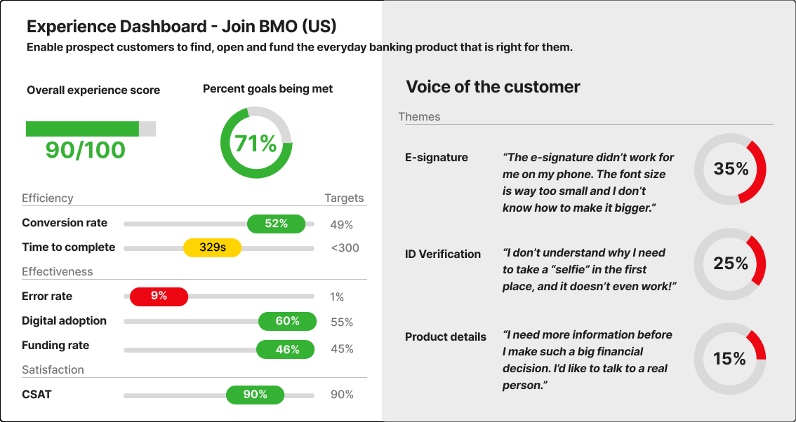
Below is an example dashboard that I mocked up with some example data.
.
At the top left you can see two score: ‘Overall Experience Score’ and ‘Percent of goals met’:
Overall Experience Score is a weighted average of all the scores below (conversion rate, time to complete, digital adoption, funding rate and CSAT), with heavier weighting on ‘satisfaction’
Percent of goals met is a simple calculation: number of goals met / total number of goals. In the case below, 4/6 goals have been met so the score is 71%. Why is 71% green? Well, taking inspiration from Intel president Andy Grove who introduced ‘OKRs’ (objectives and key results), if you are hitting 100% of your targets you aren’t ambitious enough. If you’re hitting <50% you might be too ambitious. We want to see about 75%.
Below the main goals you can see each of the metrics we’ve chosen broken into Efficiency, Effectiveness and Satisfaction. Each metric has a corresponding target, co-created between Design and Product.
On the right side of the dashboard we have ‘Voice of the Customer’ pulling out real verbatim feedback from our CSAT surveys with the percentage of frequency that each theme appeared.
6. Define ‘Deep Dive’ opportunities
Once you have the main dashboard, it’s time to take a deeper look at some of the major themes. In the dashboard above there are a few different ‘deep dives’ that you might want to explore. The error rate, for example, is very high. Time to complete is also a bit higher than the target. On the right hand side, each ‘theme’ of real customer feedback should be a deep-dive in its own right.
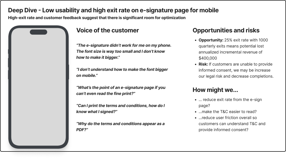
Here’s an example of what a ‘Deep Dive’ might look like. In this case we focused on the first theme from the user feedback, the e-signature page.
On the left we surface the screen in question to set context and then pull out some additional verbatims. On the right, we quantify the scale of the opportunity (e.g. 25% exit rate of 4000 quarterly visits means 1000 lost users per quarter. If each customer is worth $100, then that’s $400,000 per year). We also highlight the risk of not addressing the issue (e.g. increased legal risk). Finally we pull out some ‘How might we…’ statements to help facilitate team brainstorming.
7. Run the workshop
Once you have the dashboard and a handful of ‘Deep Dives’ it’s time to plan and run the workshop.
This is an opportunity to bring together design, product, tech, marketing and any other stakeholder you might have. It’s a great opportunity to put user needs front and center, build a shared understanding and collaborate across teams.
User problems can rarely be solved by a single team, brining stakeholders together really emphasizes that everyone is responsible for user experience.
You can structure the break-out group brainstorming sessions anyway you like, but this is my preferred method:
Ask participants to review the materials
Pre-define ‘How might we…’ statements (with room for suggestions, of course)
Ask participants to brainstorm ideas individually to address each ‘How might we…’
Share ideas, discuss together and group similar ideas together
Vote for three ideas to present back to the group
Plot each idea theme of ideas onto the a prioritization matrix (X-axis of feasibility, Y-axis of customer value)
At the end of the workshop you’ll have a list of new ideas, already plotted on a prioritization matrix.
8. Pull ideas into the product backlog
Once you have your list of prioritized ideas, it’s time to pull the ideas into the product backlog and then through the scrum cycle. Remember, Health Checks don’t supplant Agile delivery, they compliment it.
9. Monitor and report back on progress
Finally, accountability is key. Reporting back on progress of the Health Checks keeps both design and digital product accountable for delivering work that will have a meaningful impact on the user experience.
If you want to learn more, reach out to me via email or on LinkedIn.