
Case study: Secure Offers (2023)
Overview
Challenges & opportunities
From a business perspective, BMO ranked first among the ‘Big 5’ Canadian banks for prospect sales, but we lagged our peers when it came to existing customer sales.
From a customer perspective, users had no control over when, where or how they would receive offers, leading to customer frustration and lower offer conversion rates.
Solution & Outcomes
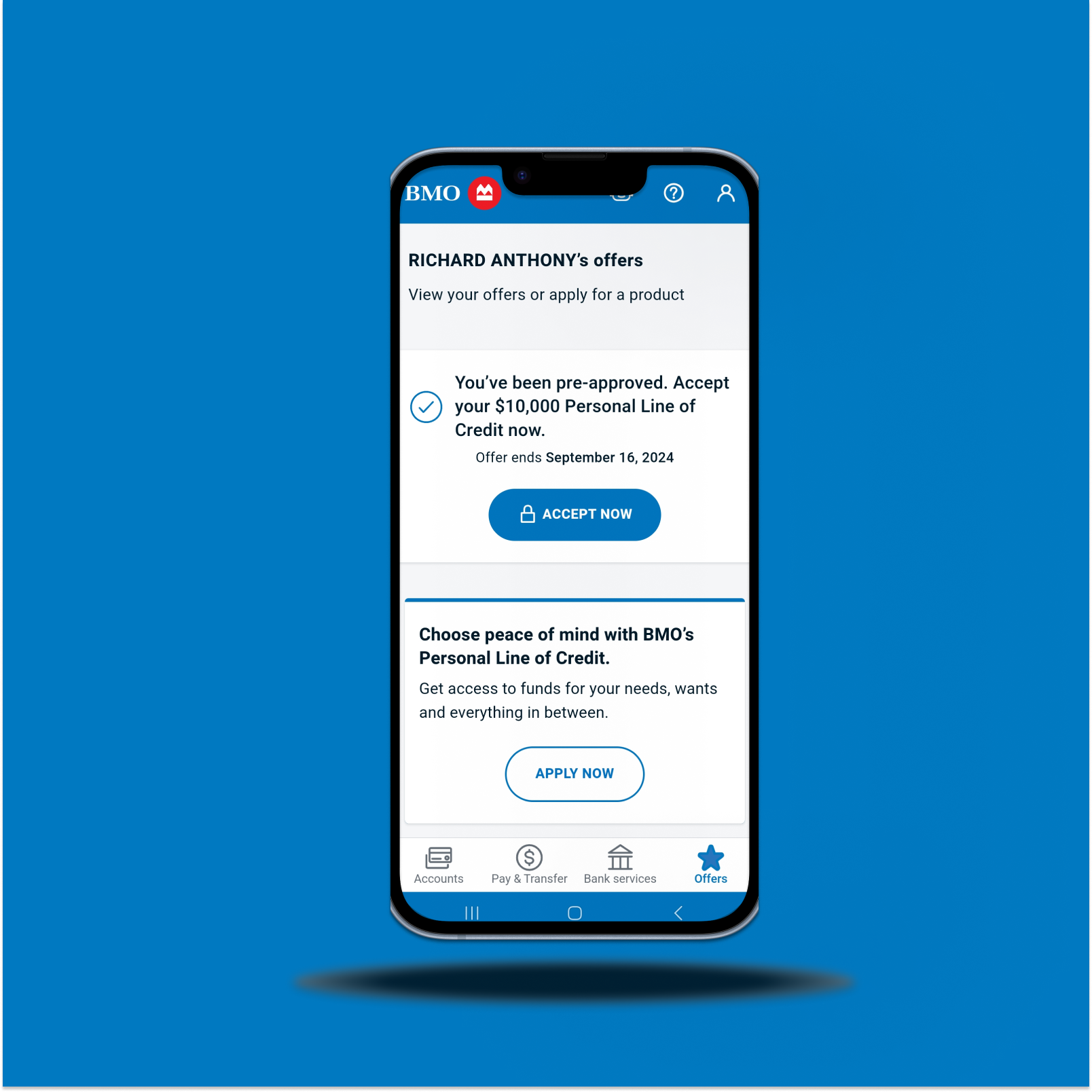
We built a persistent, personalized offers page, accessible from the main navigation, giving users the power to view offers on their terms.
The new offers page increased click through rate (CTR) 10X, sales rate increased 3X, and self serve sales increased 3X.
My role
Senior Design Manager
The full story
My role
Because this project started before funding was secured, there was no dedicated product owner, agile team or designer. As a result, I took a much more hands-on approach than I typically would as a Senior Design Manager.
I led the initial discovery process (interviewing stakeholders, understanding business requirements and sifting through existing research), ran workshops, delivered early PoC designs and built interactive prototypes for user testing.
As the project progressed I worked closely with the Director of Digital Sales for Digital Lending Acquisition and Insurance to develop a roadmap, business case, long-term vision and funding proposal to bring the project to life.
Approach
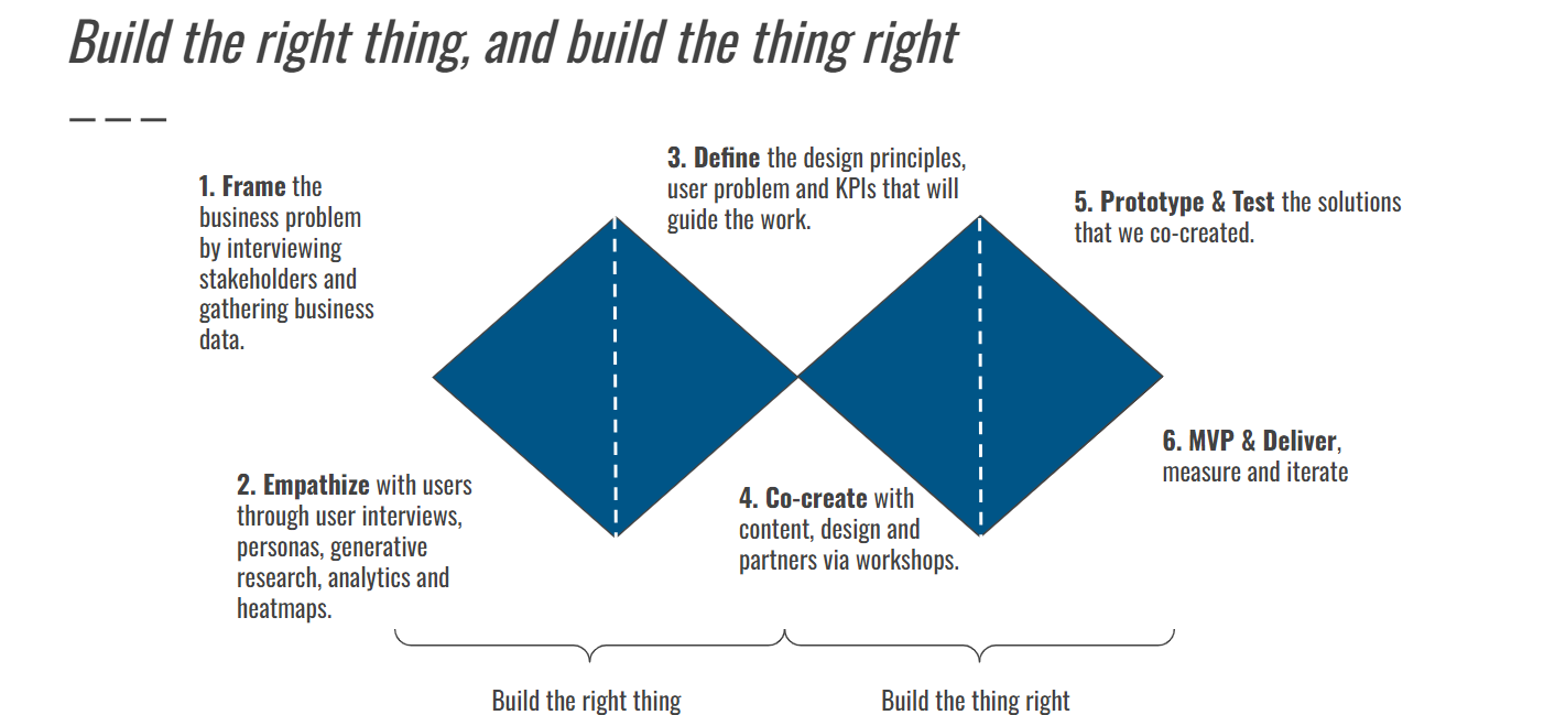
I followed the same design process that I use for all projects at BMO, ‘Phase 0’. Phase 0 consists of six steps: frame the problem, empathize with users, define the requirements, co-create & iterate, prototype & test, and MVP & Deliver.
It sounds complicated, but in reality it’s just a slightly more in-depth version of the famous ‘Double Diamond’ design process created by the British Design Council.
Discover & Define
We leveraged extensive existing user research, behavior science recommendations, journey-mapping and stakeholder interviews to understand the business and user problems.
Understanding the current state
Before beginning anything else, we needed to understand the current state of offers.
Offers are released through multiple channels (in online banking, at ATMs, in-branch, and email) simultaneously. Each offer has a strict set of rules about how many times a user may see the offer and users are also able to dismiss offers temporarily or permanently. Users are able to fulfil some offers near-instantly online through straight through processing (like a pre-approved credit card application) but other offers required more complex, manual processes.
Offers were already being served in online banking, primarily through the message centre and through banners and pop-ups on the account summary page. Pop-ups and the message centre had the highest click through and completion rates.
Process mapping
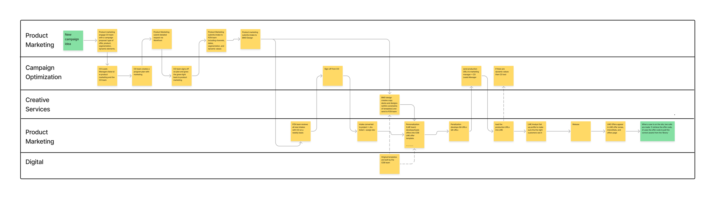
A large part of the discovery process was understanding how offers were delivered.
This required close collaboration with multiple teams, building service blueprints and process maps to understand both the user journey and the ‘backstage’ actions.
The process for delivering offers touched on many distinct (and often siloed) teams.
Offers are created by the Product Marketing team who then work with Campaign Optimization to target the most salient segments, together they build a program plan.
Product marketing then reaches out to Creative Services to design the offer assets using templates originally designed by the Digital team.
The program plan and the assets are then sent to the Personalization team who load the assets into pre-built templates.
The personalization team then conducts their own QA before sending out to CO and Product marketing for user acceptance testing.
The offers themselves are delivered to customers through multiple channels simultaneously through the LME (leads management engine) the entire offer UI would be passed as a URL to the secure side where it would appear in designated ‘offer zones’
User research
We conducted generative user research with real customers to understand how they reacted to offers in secure channels, how they interact with online banking more generally, and if they understood the functionality of the offers in the current state.
This is what we found:
Users primarily log into online banking to check balances and transactions - not to shop for new products.
When users did see offers, they assumed they could access them later (however there was no way for them to find offers themselves).
Users valued offers when they were personalized, connected to their goals, and added real value.
Real user feedback
We were also able to benefit from real customer feedback. A common theme emerged. Users were consistently frustrated by the fact that they would be served an offer as an interstitial upon login, would dismiss the offer, but were then unable to access the offer again.
User journey mapping
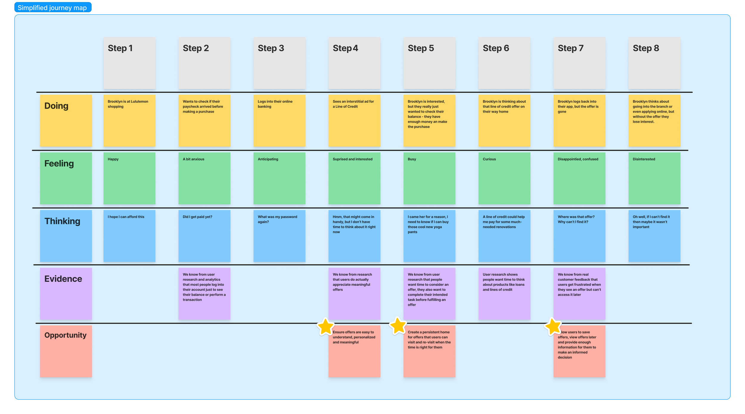
Using the research at our disposal we created a user persona and journey map from the customers perspective. (If you’re not familiar, journey mapping is a vital tool in the design thinking process) Here’s the hypothetical scenario that we mapped out…
Brooklyn is a busy mom and like most BMO customers she uses her banking app primarily to check her balance and pay her bills. One day, while in line at the grocery store, Brooklyn decides to check her banking app to make sure she has enough room on her credit card before paying for a particularly big grocery bill. When Brooklyn opens the app she sees an offer for a pre-approved line of credit. She’s in a rush and doesn’t have time to read the offer so she dismisses it and checks her balance as planned.
On the drive home Brooklyn thinks back to the pre-approved line of credit offer. Money is tight and she could use a little bit of extra flexibility, maybe she could even finally get to that DIY project she’s been putting off. Once she gets home and puts away the groceries she opens her app again to look for the offer, but this time it isn’t there. In fact, she looks everywhere but still can’t seem to find it. Frustrated, Brooklyn closes the app and moves on to something else.
In this context the customer pain points of the existing experience are clear. Equally clear is that BMO has missed an opportunity to both sell a profitable financial product and help a customer make real financial progress.
Behavioural science research
We teamed up with IBM to develop Behavioural science insights to guide our work. The IBM Behavioural Science report was over 200 pages long, but I can sum it up into two key findings:
1) Drive offer engagement with expectant value theory. (i.e. when perceived value > perceived effort users will accept an offer).
2) Drive offer fulfilment by understanding the depletion effect (i.e. users lose motivation in the face of friction).
In design terms this means creating an offer page that makes it easy to understand the offers, and build fulfilment flows which minimize user friction.
Competitor research
We presented a detailed competitor analysis deck to senior leaders. Some of the key themes from both FIs and Non-FIs.
1) Products and offers should be on the main nav
2) Use a personalized message to signal that the offers are tailored to the individual.
3) Include offers in contextually relevant areas.
4) Personalize the actual offer as much as possible based on user data.
5) There was a clear gap in the market and BMO had the opportunity to build a secure sales offer experience unique in the Canadian market.
Landing two planes at once
To add to the technical complexity of the project, online banking was going through a massive redesign and re-platforming. The offers page would fall into phase two of that process, but given the complexities of both projects it would be like “landing two planes at once” to quote one executive.
Summarizing the business and user need
From a business perspective, we needed to get more offers to customers, faster and more frequently. We also needed to change the UI of the offers to make them more attractive to customers.
From a user perspective, we needed give customers control over when, where and how they would see offers.
Ideate & Co-create
We conducted workshops with partners from digital product, design and tech to develop a backlog of ideas and sketch potential solutions. Then we translated these into low-fi wireframes and high-fidelity proof of concepts.
We then presented our consolidated recommendations and initial designs back to senior leadership, continued to iterate and then built interactive prototypes for user testing.
Prototype & Test
We conducted usability testing to validate our work, uncover any unexpected issues and further refine our designs.
The results were clear. Users found the page easy to discover, it met their expectations, and they valued the ability to view offers on their own terms.
MVP & Release
Once we were confident that we had an ideal version of the offers page (as validated by user testing) I began building a business requirements document detailing all the features and functionality that would be required.
Once I had a draft, I worked closely with developers, QAs and system architects from multiple teams to deliver a detailed requirements document, create a notional systems architecture and scope the work.
But there was still a problem… who was actually going to pay for it?
There was still no dedicated team, no dedicated funding, and no commitment to launch. We had the work scoped, we also had an estimate of how many incremental offer completes and digital sales that the offers page would deliver.
I worked closely with the Director of Digital Product for Digital Lending Acquisition and Insurance to bring together these elements into a single business case, roadmap and long-term vision for the offers page. We delivered this plan to the Head of Design, Head of Digital Sales, Head of Secure and the Chief Digital Officer.
Once we knew who was actually going to build the offers page we could continue to refine our design into an MVP that met user needs and business requirements while still being feasible from a tech perspective.
MVP features
The MVP we ultimately launched had the following features:
The page itself. The page itself was the foundation of the project it provided a persistent ‘home’ for offers.
Simple and easy navigation. By placing the offers on the mobile nav bar at the bottom of the screen we were able to make finding the page incredibly simple and intuitive.
Persistent offers. Offers on the offer page are not subject to any engagement rules. Offers will only disappear when the offer is fulfilled or the offer itself expires. This was more complex to build than it sounds. For each campaign we essentially duplicate the offer with a separate set of rules and functionality and deliver both sets of offers simultaneously to the user. When an offer is fulfilled in any channel, it disappears in all channels.
New offer UI which utilizes a ‘card’ format to make it easier for customers to scan, understand and conduct the subconscious cost-benefit analysis faster. Ditching banners also helped us avoid the phenomenon of ‘banner blindness’.
A hierarchy of offers which placed the most valuable offers at the top of the page with a distinct UI designed to help users identify and understand the offers quicker. Each offer has a marketing score based on the user and business value. Pre-approved offers with straight through processing would have a higher score than an invitation to apply offer since the former could be fulfilled immediately while the latter took longer with more manual intervention.
Static sales links leading directly to secure sales applications.
List of post-MVP backlog items
We cut a number of features which were technically more complex and provided less user value, including:
The ability to filter offers. This would require both new LME upgrades to add additional metadata fields and additional layers of logic in the secure site platform itself. At the time of launch, most users would only receive a handful of offers and filtering would not be needed.
Offer notifications. adding offer notifications on the menu tab proved to be too complex of a build because it would require additional layers of logic in the secure site platform itself to recognize when offers appeared, log if the users has seen each offer, count the number of offers, and then display a notification if there was a new offers.
Save offers. With a limited number of offers and the new ‘always on’ persistent offer logic there was no need to allow customer to save offers at launch.
Mass offer API. We hoped to pull in mass offers via API from the public site, but ultimately cut this functionality to reduce scope.
Results & Learning
Customer outcomes
Users can now actively engage with offers, rather than passively waiting for an offer to appear. That means no more losing out on an offer simply because it hits an arbitrary impression limit, no more getting an offer while in line at the grocery store and dismissing it because you don’t have time to consider it, no more uncertainty about what offers are available at any given moment.
Early results
10x offer click rate (0.75% to 7%)
3x offers sales rate (0.5% to 1.5%)
Over 3x self-serve sales start rate (4% to 14%)
Learnings
The real challenge of this project wasn’t the research, design or development - although there were certainly a fair share technical complexities and limitations - the real challenge was organizational.
The offer delivery process spanned multiple teams with no single owner. The most important part of my job was not leading a design team, but building connections between different teams, navigating ambiguity, driving alignment, managing stakeholders and ultimately delivering the best end product for both customers and the business.
This lesson, in my opinion, sums of life in a digital team at a large enterprise like the Bank of Montreal. Often the ‘work’ itself is the easy part, the real challenge comes from bringing stakeholders together.